CampusEats
UX Design
CampusEats is a meal-kit platform created for university students who often struggle to maintain healthy eating habits while balancing busy schedules and tight budgets. During my final-year design studio course, I led the UX and UI design for the platform, shaping the full experience from initial research to final prototypes. The aim was to create something simple and reassuring — a way for students to access meals that are affordable, personalised, and easy to fit into a demanding routine.
The idea grew from a shared observation within our team: students don’t avoid healthy food because they want to; they avoid it because it feels too hard to manage alongside everything else. CampusEats was designed to make that challenge feel a little lighter.
Understanding the Problem
Students consistently told us the same story: between long lecture days, part-time jobs, commuting, and inconsistent schedules, cooking simply wasn’t realistic. Many relied on fast food or skipped meals entirely, not out of preference, but because it was the quickest option available. Our research showed that most students wanted to eat better but lacked the time, knowledge, or kitchen resources to prepare balanced meals. Many lived in shared accommodation with limited space or equipment, and almost all struggled with the rising cost of fresh ingredients.
Through interviews and surveys, it became clear that the typical meal-kit model wasn’t meeting student needs either. Kits were too expensive, required too much preparation, and didn’t fit the unpredictable nature of university life. Students wanted something flexible, affordable, and quick — something made for them, not the average household.
The Opportunity
These insights shaped a clear opportunity: a meal-kit service tailored specifically to students’ constraints, preferences, and schedules. Instead of forcing users into long recipes or complicated choices, CampusEats needed to offer meals in a way that felt manageable and supportive. This meant building customisation into the experience, making nutrition easy to understand, keeping prices low, and offering campus pickup locations so students didn’t have to plan around deliveries at home.
From this foundation, the concept grew into a platform where students could browse simple meals, personalise their preferences, and rely on consistent, predictable pickup points across campus. The experience had to minimise friction while still giving students a sense of choice and control.
My Role
Within our six-person team, I led the full UX and UI process — from early interviews and user flows to wireframes, prototypes, and final interface design. I worked closely with developers to ensure the structure was feasible, but the design direction, layout systems, interaction patterns, and visual identity were all my responsibility. This meant not only creating the interface, but also understanding how students think, what they prioritise, and where they experience frustration when ordering meals.
Throughout the project, I kept the focus on clarity and simplicity. Students already have enough noise in their lives; the design needed to feel calm, predictable, and considerate of how quickly someone might be moving through the app between classes.

Designing for Students
As I mapped the user experience, I noticed how important it was to reduce the number of decisions students had to make. Many are tired, rushing, or simply trying to grab something before their next tutorial. This informed the structure of the app, which keeps information organised and avoids overwhelming the user with too many steps. The ordering flow was designed to feel natural, creating a rhythm between browsing, reviewing ingredients, personalising preferences, and checking out.
During usability tests, students responded well to the clean layout and the predictable sequence of actions. They appreciated that the interface didn’t pressure them to choose quickly, yet still allowed them to move through the process without unnecessary interruptions.
The Design Approach
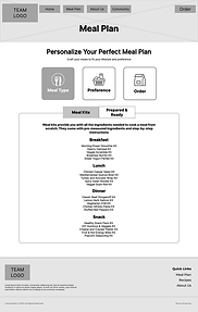
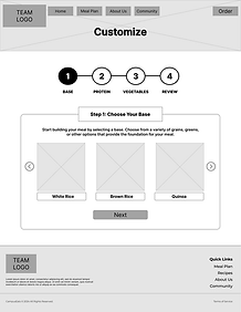
The design process started with sketching and mapping out the core flows, focusing on how students would move through the meal plan, ordering, and customisation features. After establishing a simple information structure, I created low-fidelity wireframes to test the layout before moving into visual design. The meal plan section became a key area for iteration, as students wanted flexibility without feeling overwhelmed by options.
As the visual style developed, I kept the palette warm and grounded to reflect comfort and approachability. The spacing, typography, and card layout were all designed to make information easy to digest, even when scrolling quickly on a small screen.

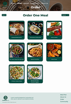
Key Screens and Interactions
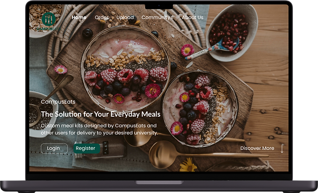
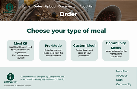
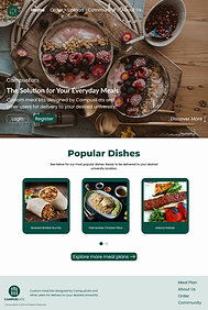
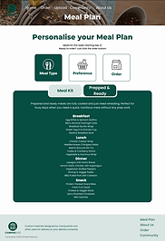
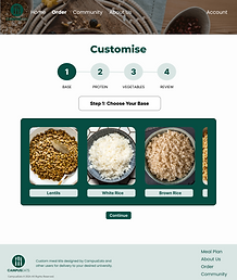
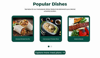
The homepage introduces the platform through familiar, comforting visuals and a clear path into ordering. From there, students can explore meals through simple categories such as meal kits, pre-made meals, custom options, and community dishes. The custom meal flow in particular allowed students to build something that suited their dietary needs without feeling complicated or time-consuming.
Every key interaction was refined based on student feedback. The nutritional modal, for example, was originally too text-heavy, so I adjusted the information hierarchy to highlight the essentials and reduce cognitive load. Visual cues and subtle colour changes help guide students through the app, keeping the experience intuitive and reassuring.
Outcomes
During testing, students described the interface as “easy to understand” and “straightforward”, which aligned with the project’s core goal of reducing mental effort. Many appreciated how quickly they could browse options and customise preferences, and several noted that the app felt more affordable and realistic than typical meal-kit services.
The project also highlighted areas for improvement, such as clearer pricing within meal plans and better verification of community-submitted recipes. These insights shaped the final refinements and informed future development ideas.
Final Thoughts
Designing CampusEats reminded me that good design isn’t about adding features, but about understanding real constraints — in this case, the unpredictability of student life. The experience needed to support users who might be stressed, distracted, or in a rush, and that required empathy more than complexity.
If I were to continue developing the platform, I would focus on refining the mobile-first experience and exploring smarter recommendation systems based on budget, dietary needs, and class schedules. The project strengthened my appreciation for designing with clarity and care, especially for users who rely on simplicity in their daily routines.